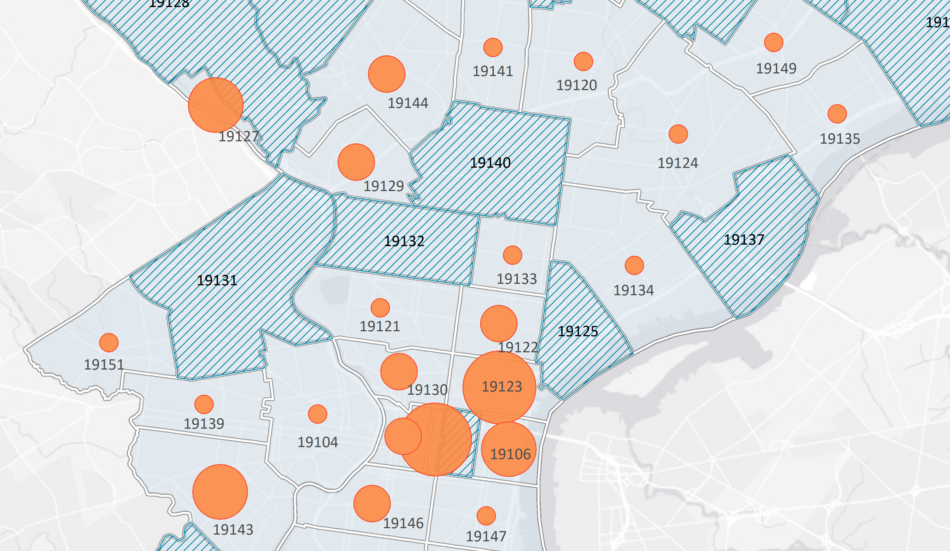
Visual information is quicker for our brain to process and easier for us to remember. If you’re a nonprofit, you need to get your message across and make it stick. Maps and location data are visual, relatable, and beautiful, what better way to show of your advocacy efforts!
The Committee of 70 explored and shared the results of their post-election polling place survey this fall. Thousands of rows in a spreadsheet were turned into beautiful maps that effortlessly display hotspots of polling place issues and are easy to share with the public and elected officials to advocate for reform.
Join us for the second installment of our Map Readiness Webinar Series to learn about how you can visualize your impact with location data and stand out from the crowd.
We’ll be focusing on maps and location data for this webinar, but even if you don’t know the first thing about latitude and longitude, never fear! We’re here and we’ll show you the ropes. You’ll be whipping up maps to impress your funders and constituents in no time.
If you want to learn about how to find or collect some data ahead of time, check out our first webinar in the series, Getting Open Data to Further Your Cause
Second Webinar – Putting Your Data on the Map to Communicate Your Impact
- What is Location Data
- Geocoding your data
- Intro to free desktop mapping apps for data-driven decision-making (eg QGIS)
- Intro to free tools to put web maps on your website or blog (eg CARTO)
Putting Your Data on the Map to Communicate Your Impact
Wednesday, January 11th, 2017
2:00 PM – 3:00 PM EST
Upcoming Webinars in the Map Readiness Series
Third Webinar – Your Data at Work with Data Analysis and Visualization
- Spatial analysis and maps
- Effective visualization
- Sharing your story
Make sure to check out the recording of our first webinar in the series, Getting Open Data to Further Your Cause, to learn how to find, collect, and use open data to boost your advocacy efforts.
We love making maps and we bet you will too. Join us for this webinar to get started!

